
Beige Doesn’t Have to Be Boring
At first glance, this custom space appears saturated in color. But, look again. It’s neutral. The backdrop of the entire room is a wonderfully warm “greige” – a hybrid of beige and gray pigments. All of the major furniture pieces, though essentially the same neutral tone, are given personality through a variety of textures and tone on tone patterns.
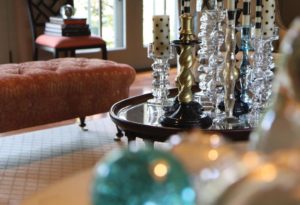
Here’s the trick. Peacock inspired accents may not seem like the subtlest of shades, but when used with a light hand, they radiate without overwhelming the space.
Used in floor length drapery panels, accent pillows, and art, the saturated tones create a sense of warmth and opulence.
Best of all, when you feel inspired, the neutrality of the overall design ensures that just a few key changes to the accents will result in a fresh new vibe, without major investment.
Article originally seen in the March 2016 edition of Susquehanna Style.